Pinks & Plaster Tones
coral wash dreams
Pinks are often more nuanced than they first appear, typically sitting within two distinct undertone groups. The first leans cooler, with a subtle blue base, often perceived as a more classic or traditional pink. The second carries a warmth, with soft orange undertones that move into coral and peach.
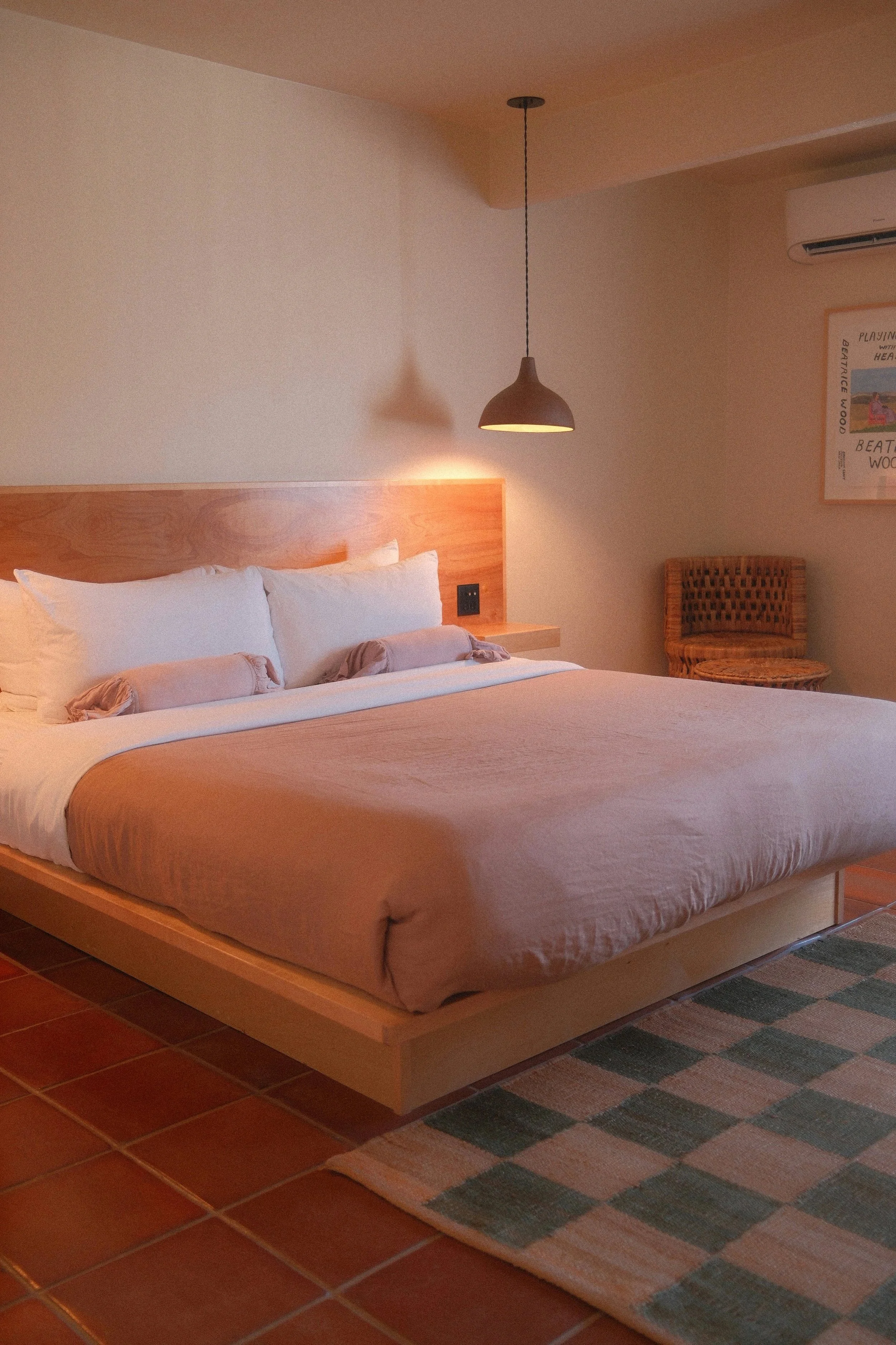
When aiming to achieve a plaster-like finish, I tend to favour the warmer end of the spectrum. These tones bring a natural softness, creating spaces that feel relaxed, sun-washed, and gently lived-in.
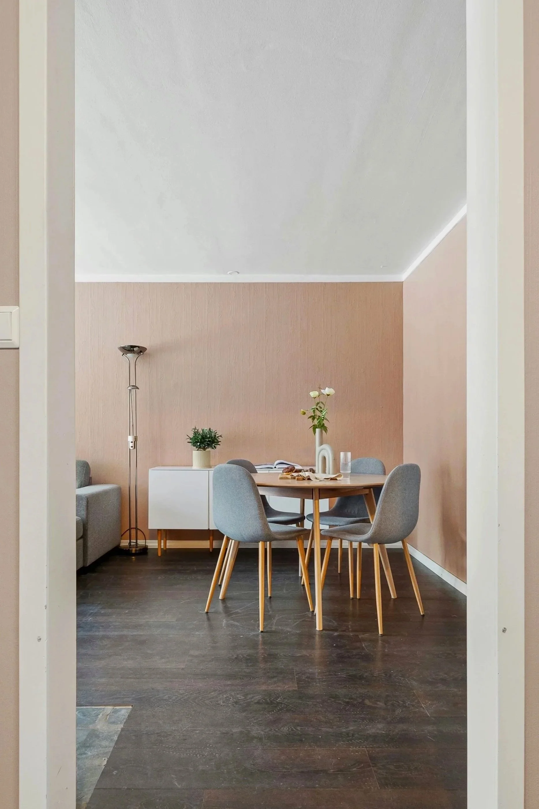
Lighter shades of pink work particularly well in north-facing rooms, where they can counterbalance cooler natural light and introduce a sense of warmth. Over recent years, these plaster tones have grown in popularity, often seen in limewash finishes that add texture and depth to a space. Paired with muted green-blues, they create a soft contrast that evokes a subtle Mediterranean influence.
blush watercolour
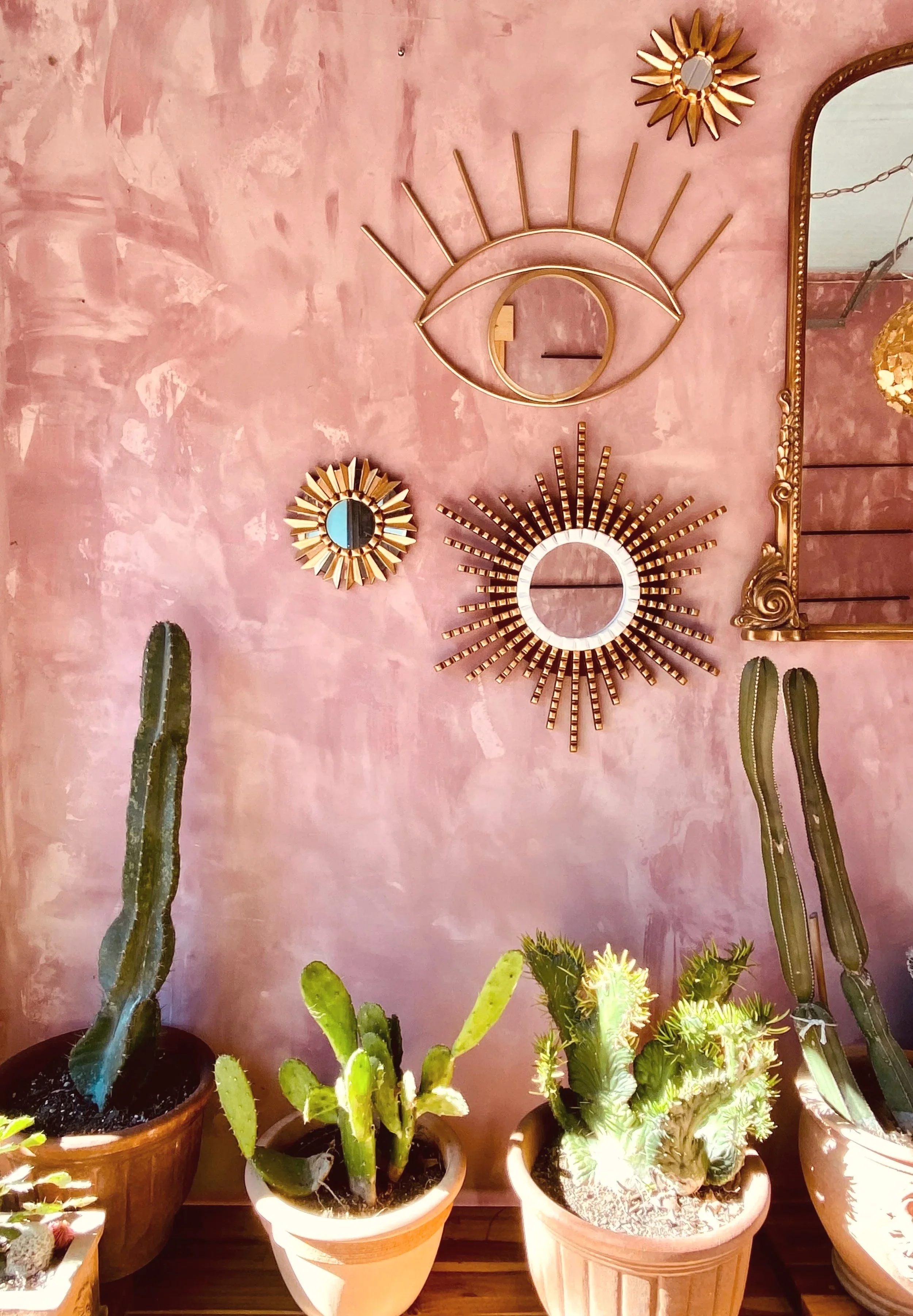
For those looking to work with tonal variation, introducing deeper, pared-back terracotta shades through woodwork or trim can add quiet definition. This layering of colour brings depth and dimension, particularly within a colour-drenched scheme.
Psychologically, pink is often associated with calm, nurturing, and comfort. It has the power to soften a space, creating a sense of safety and connection, making it a perfect backdrop for moments of rest and reflection.
Pinks have a natural ability to create spaces that feel nurturing and inviting, softly uplifting, yet calm and restorative.